[[{“value”:”
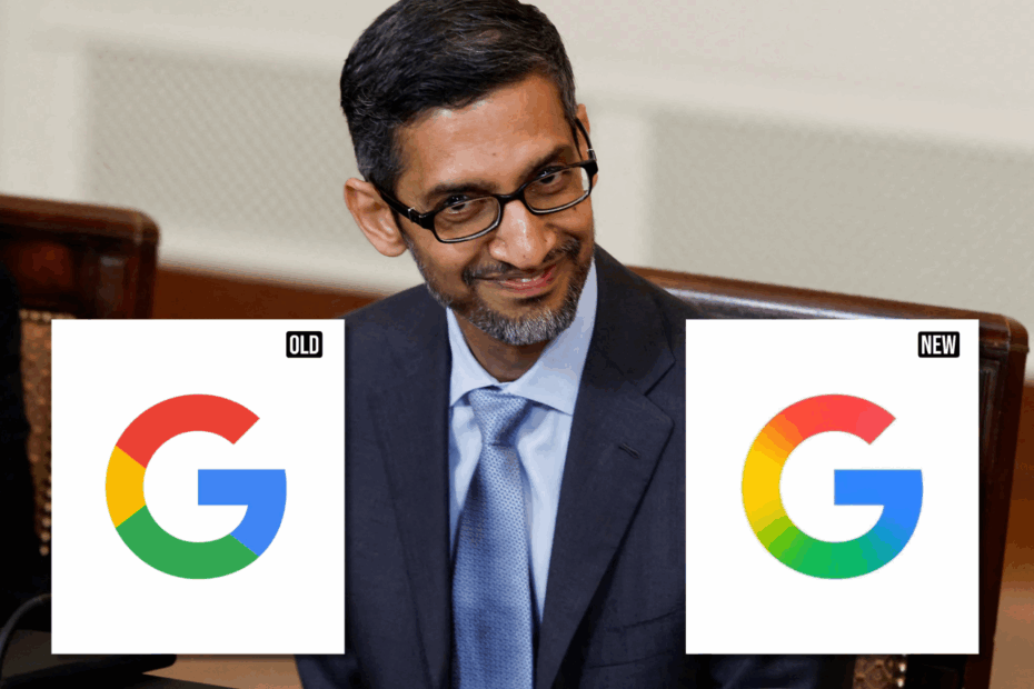
For the first time in nearly 10 years, Google has updated its iconic circular ‘G’ logo, triggering a wave of reactions across the internet. This marks the first change to the symbol since September 2015, when the Sundar Pichai-led tech giant significantly updated its logo (‘Google’) to a modern typeface called Product Sans.
At the time, the company transitioned from a lowercase white ‘g’ on a blue background to the now-familiar circular ‘G’ made up of four solid colours—red, yellow, green, and blue.
In its refreshed version, Google has replaced the four solid segments with a smooth gradient that blends the colours into one another. The refreshed design introduces a more vibrant, softer aesthetic, reflecting a shift in Google’s broader visual language. It aligns closely with the gradient style seen in the Gemini AI branding and recent updates to the Search app interface.
The change is subtle but meaningful. It aligns with Google’s increasing focus on artificial intelligence and its intent to present that shift through both product innovation and visual identity.
The new gradient logo is already visible to iOS users via the Google Search app and has also begun appearing on select Android devices through the beta release of the Google app version 16.18. Pixel devices are among the first to receive the update, although Google’s traditional six-letter wordmark remains unchanged on most web platforms. A wider rollout across services and operating systems is expected in the coming weeks.
Google’s new logo. Now also updated on Android devices 👀 #Google pic.twitter.com/gnDMwjwCtQ
— Gerwin van Giessen (@GerwinvGiessen) May 12, 2025
According to a report by 9to5Google, the refreshed logo has been designed with adaptability in mind, ensuring better visibility and responsiveness across varied screen types—from smartphones and tablets to desktops.
It remains unclear whether this new visual style will extend to other flagship products like Chrome or Google Maps, which still use the original solid-colour motif. However, the logo refresh signals the company’s intent to reflect its AI-first strategy through both product functionality and brand presentation.
Though the update is modest, it has not gone unnoticed. Reactions online have been mixed—some users appreciated the refined aesthetic, while others poked fun at the subtlety.
Google: we need a new logo
Designer: dw I got you
*clicks layer blur* pic.twitter.com/YQuyp6sgNb
— Charles Patterson (@CharlesPattson) May 12, 2025
Google’s new logo… pic.twitter.com/I8vPMJEUHV
— Ray (@rayyamartino) May 12, 2025
Google’s new logo on Android! I hope they put the rest of their apps soon too. #oneui7 #samsung #android #google pic.twitter.com/zphqEZYkr9
— Cristopher (@_cristopher_ken) May 12, 2025
“}]]
Read More Indian Startup News : Latest Posts